
With so many individuals using the internet on their phones these days, it’s critical to provide excellent mobile site performance. You won’t be able to appeal to the 95% of online consumers without it, and your organisation will likely lose targeted traffic as a result. But responsive website design is here to help you out. When a website is built with flexibility in mind, it adapts to the size of the device and browser in order to show the information correctly. Segments are defined as goal ranges within which specific outputs are defined.
A company website’s objective should be to act as an online marketing tool, which means it should give visitors the information they want as well as the tools to convert them into leads or customers. Skilled responsive website design services want their sites to be as simple to browse as possible, with graspable material. Responsive websites are designed to automatically adjust to these various dimensions. The information, graphics, and structure of a responsive website are presented differently on different devices. We’ll talk about why you should obtain responsive website development for your business in this article.
Enhance Browsing Experience:
All through the path, a responsive website allows for a smooth and intervention free experience. Site operators can offer high-quality data to users throughout multiple devices thanks to responsive website design, and offline browsing features allow sites to be readily accessible while on the run. This becomes more essential as tablets and smartphones become more common. Email communications and information from hybrid web apps will be accessed more frequently when on the go and without access to the internet.
Flexible on all devices:
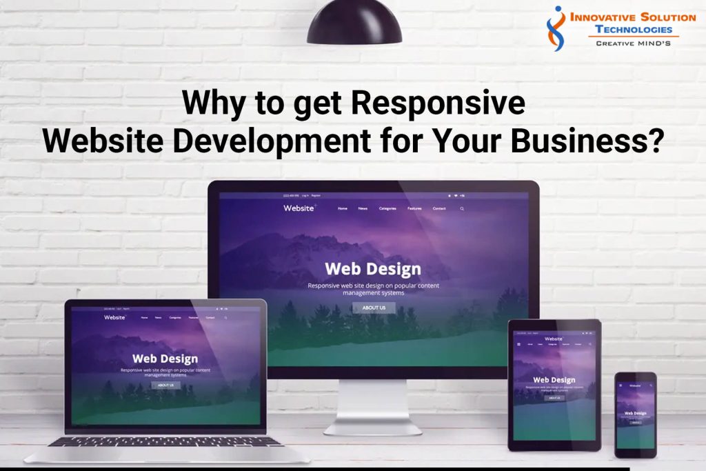
Users can view and engage with your website efficiently on a range of devices with the help of responsive website design. Adjustable layouts and graphics are included in responsive web design. A responsive website looks for sizes and configurations and then creates the fullest potential outcome for the laptop, pc, tablet, mobile phone, or any other platform on which it is shown.
Especially the way people use the internet today, and with online traffic through mobile phones usage on the upswing, having a mobile-friendly site is essential if you want to stay competitive. When it gets down to the sustainability of your website, the user experience is important. Developing a responsive website that visitors can view from any device demonstrates that your company is current and aware of its users’ demands. Revamping your site to ensure it is compatible will improve your customers’ interaction and assist you push your business to the next stage.
Saves Your Time:
Making a distinct mobile version of your site that was provided when a decreased display size was identified was formerly a standard approach. However, creating a mobile version of the website takes longer than creating a responsive website that looks excellent and functions well on every device your customers use. These advantages may be obtained without using responsive web design. You may have your developers direct mobile customers to a different site that is tailored to their needs.
Budget Friendly:
It is debatable if developing a responsive website is less expensive than developing a distinct e-commerce or smart site. A responsive website is more complex to create in terms of cost. It does, however, have a lot of benefits. You just need a single edition for each type of device, such as desktop, mobile, kindle, tablet, and so on, rather than several versions for each type of device. Furthermore, developing apps for each device necessitates additional funding.
Boosts Conversation Rate:
A conversion focused responsive website design will minimise unnecessary navigating and design components, resulting in an ideal viewing experience with crisp pages and quick page loading screens. More sales and communication submissions will come as a result of your efforts. Conversion rates, on the other hand, would stay stagnant if your website does not accommodate mobile users and adapts to any device effortlessly.
The total time on a website is referred to as the bounce rate. It determines how efficiently people return to a website or depart. Once it relates to analysing the hours spent between both the arrival and departure points of users viewing a specific site, Google considers the user behavior in account for ranking. Numerous responsive website design services in India can help with this. These responsive website design services specialists design products that suit the contents, allowing websites to stay afloat at the top of the search engines listings by lowering bounce rates and raising conversation rates.
Elevates Your SEO:
The majority of websites with responsive web design have better SEO than the greater part. a responsive website design company will assist your website in reaching a larger audience without requiring more expenditure. These sites are particularly easy to find for search engines, and they are rewarded with higher ranks and exposure as a result. Similarly, your staff will not be responsible for several websites and will instead focus solely on one. This is how your company will be able to easily achieve its aims of gaining more consumers.
Easy Analytics:
When you have two different versions of your website, you’ll need to watch two different sets of web analytics to figure out where your visitors are visiting from or how they engage with your site. This means you’ll have to keep a record of several registration and thank you pages, as well as conversion scores, pathways, and other elements. Your website metrics are considerably improved with a responsive site because you’re just dealing with one piece of data. You’ll still be able to see which devices and platforms your users are using, where they leave your site, and how long they stay, but you won’t have to parse data from numerous datasets to get a fuller understanding.
Conclusion:
Versatile design is crucial for being forward of the race and ramping up production with the growth in smartphone usage. responsive website design allows your website to shift, glide, and reorganize into numerous format versions rather than developing several websites to serve on multiple devices. The final outcome is an attractive page that your users will love no matter how they browse, while you have the advantage of not having to sacrifice the design, functionality, or identity of your website.

 Tips & Tricks for 2022")

